top of page


CLIENT:
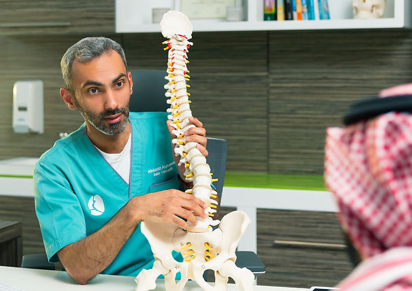
MYO Osteopathy Center
CHALLENGE:
MYO, a modern osteopathy and wellness center, sought a calming yet premium identity that reflects holistic healing and human connection. The challenge was to create a unified visual system that balances medical credibility with a warm, approachable atmosphere suitable for both clinical and lifestyle applications.
RESULTS:
The new branding positioned MYO as a distinctive wellness destination, easily recognized for its soft colors and modern design language. It created an inviting environment that resonated with both new and returning clients, reinforcing trust and comfort in the brand.
RESEARCH & INSIGHTS
Research into wellness and osteopathy brands revealed a market often leaning too clinical or overly spa‑like. Insights pointed to a need for balance a visual language inspired by the human body’s natural curves and soft movement, paired with colors that evoke calmness and trust.


CREATIVE SOLUTION
The identity centered on a minimalist abstract form inspired by muscle flow and skeletal alignment. A soothing palette of muted greens and soft blush tones was chosen to convey wellness and serenity, while elegant sans‑serif typography in Arabic and English ensured clarity and modernity. The system was designed to work seamlessly across signage, interiors, uniforms, and digital platforms.


CASE STUDIES


bottom of page